
I tested 10 AI prototyping tools so you don’t have to.
Can one prompt really clone a live page? My experience building an A/B test with AI prototyping tools.

There’s a lot of hype right now: tools promising they can “clone” a site or web app with one prompt. I’ve always found that claim… optimistic. Lately, I’ve been hunting for a tool that lets me clone a live page and modify that clone so I can quickly prototype A/B test variants without needing repo access or a full design system.
My current workflow is clunky: screenshot the page → paste into Miro/Whimsical to explain UX changes → sometimes into Figma for higher-fidelity mockups. With all this AI buzz, I figured at least one product would nail this very specific “A/B test prototyping” use case.
To make it fair, I tested 10 tools. The catch: each one had to do its best work with one prompt. That forced me to standardize the ask—after about seven iterations, I landed on a YAML prompt that produced the most consistent behavior across tools. I know some of these aren’t designed to “clone from a single prompt,” but I evaluated them anyway for comparability.
Below you’ll find the test structure, then the results: ranked from worst to best, with clear, non-fluffy notes so you can decide what might fit your workflow.
Experiment structure (quick overview)
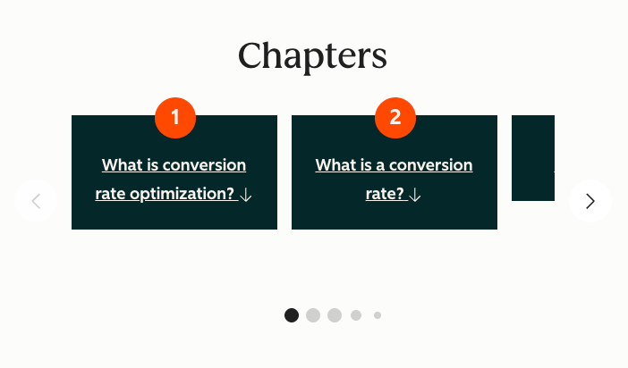
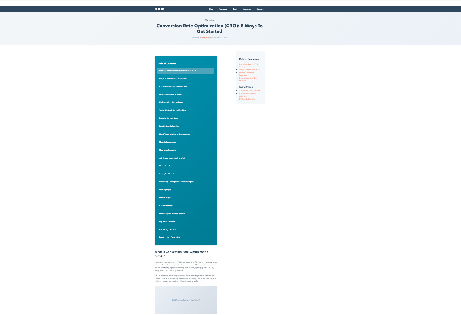
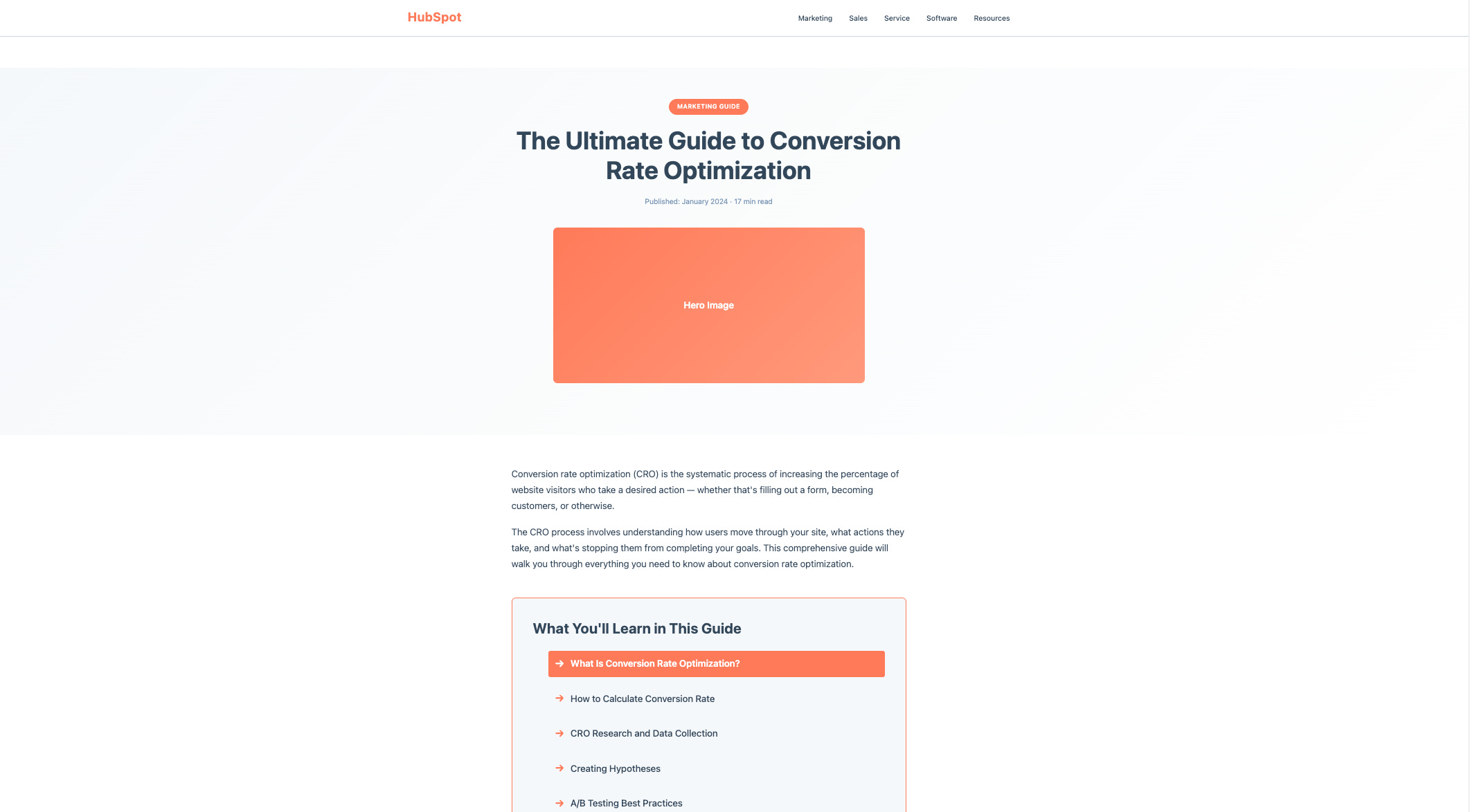
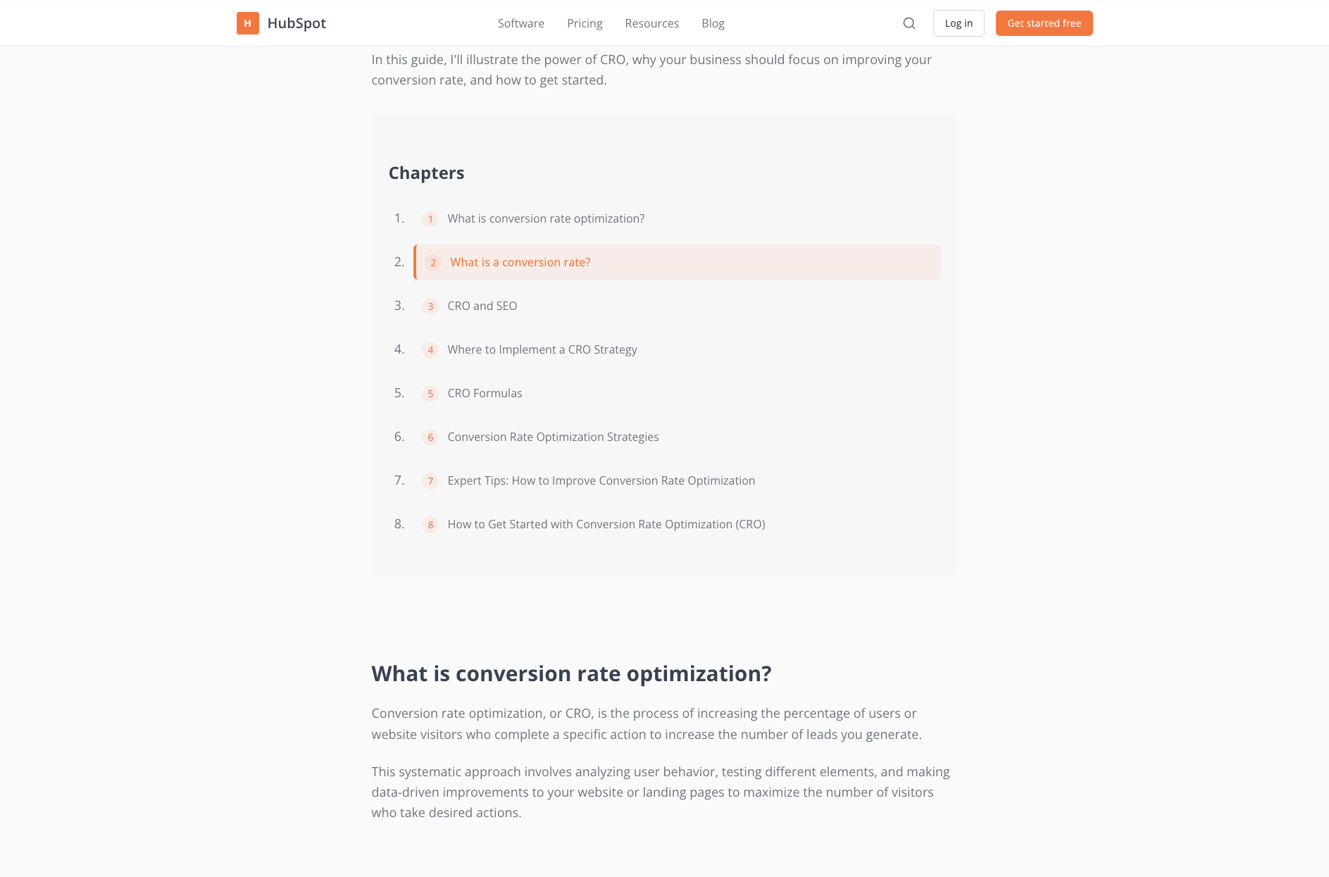
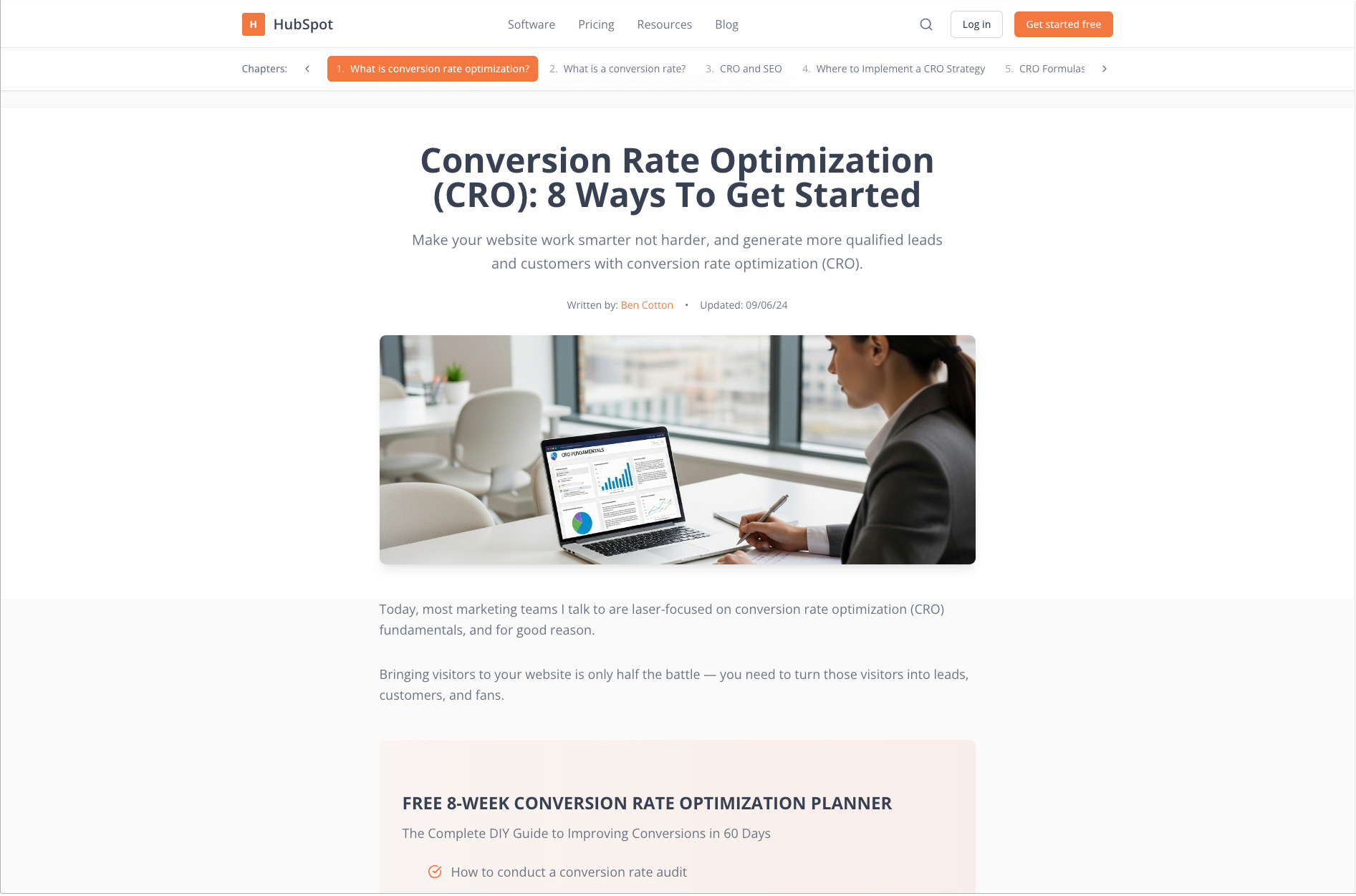
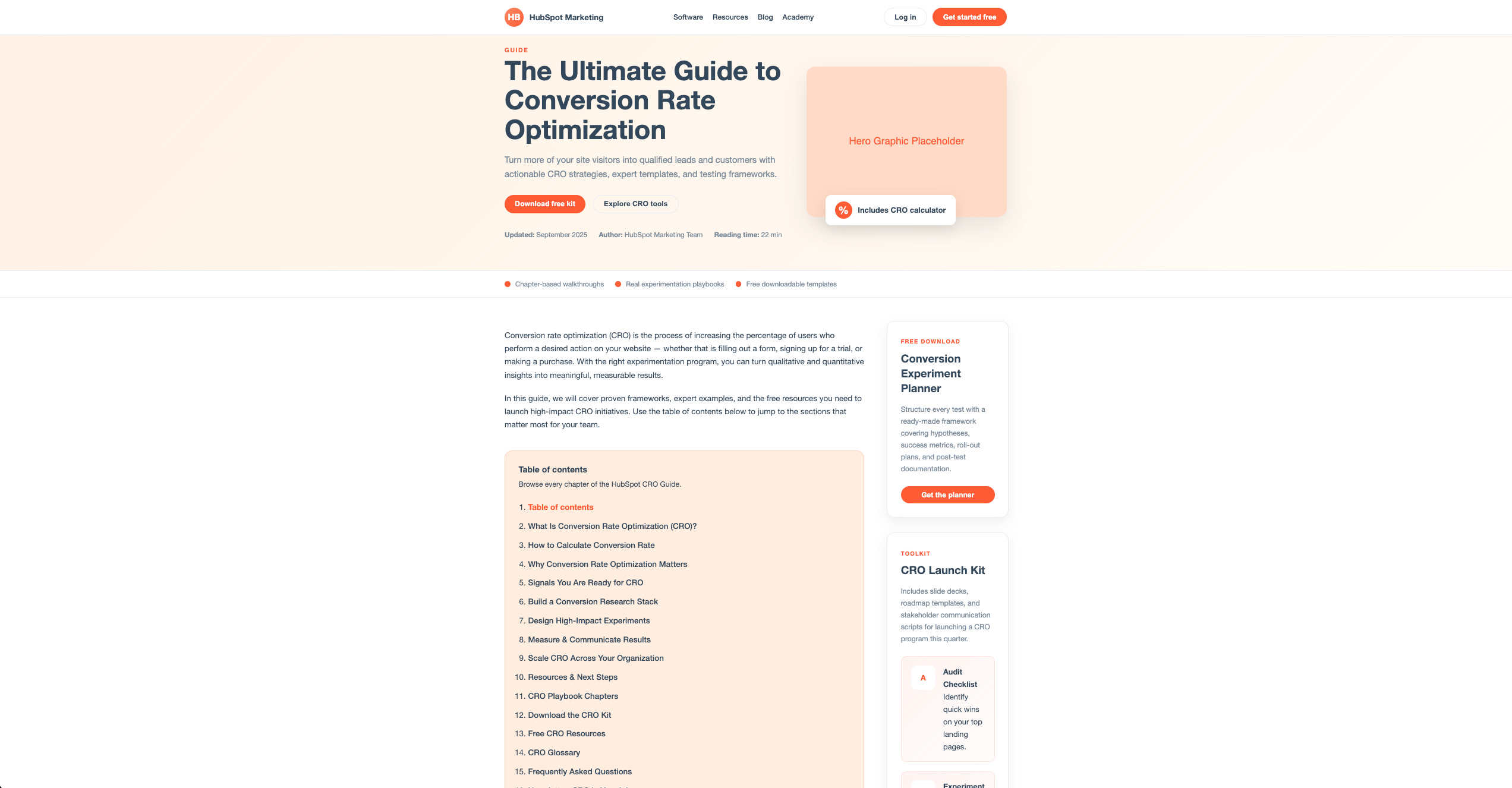
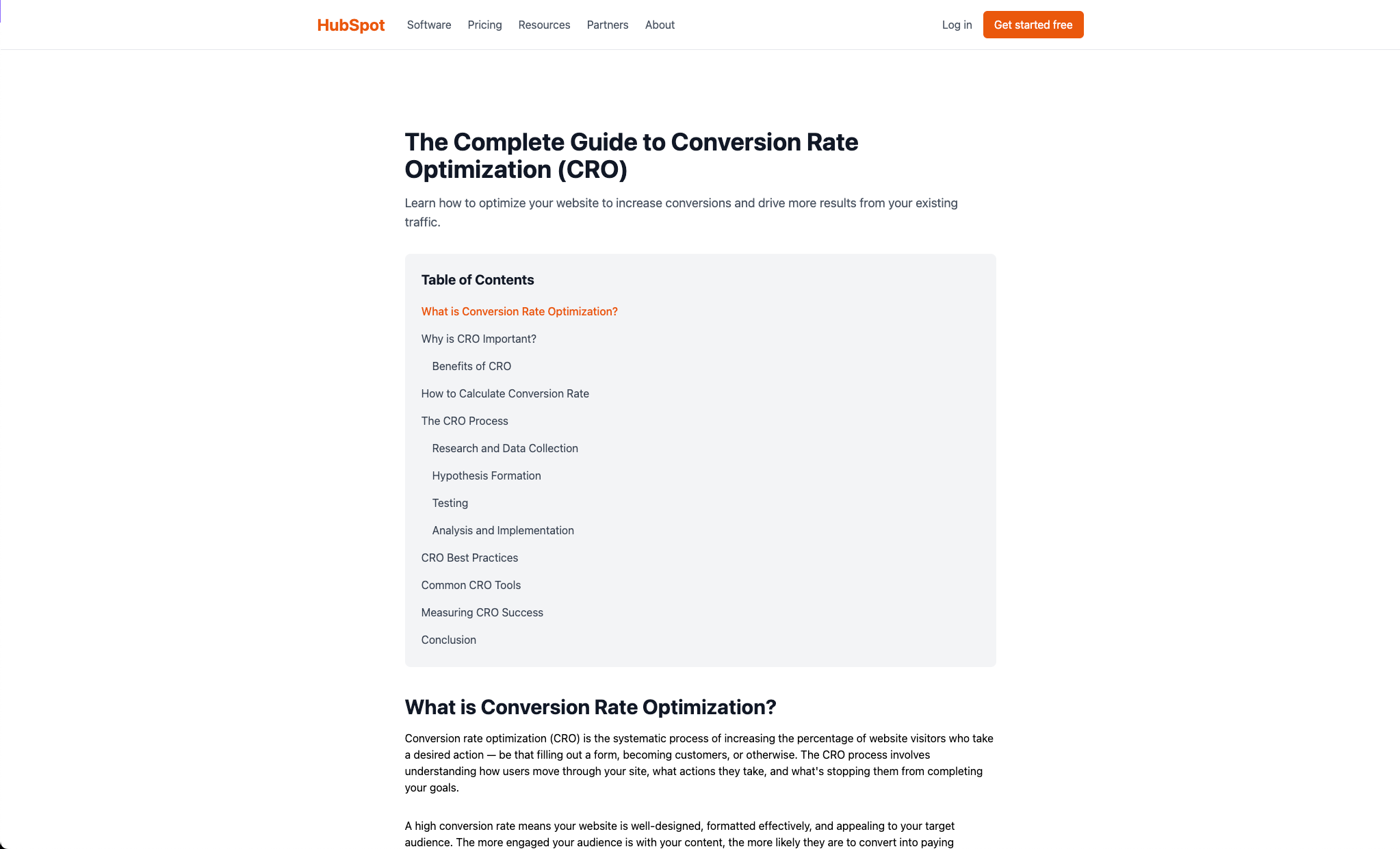
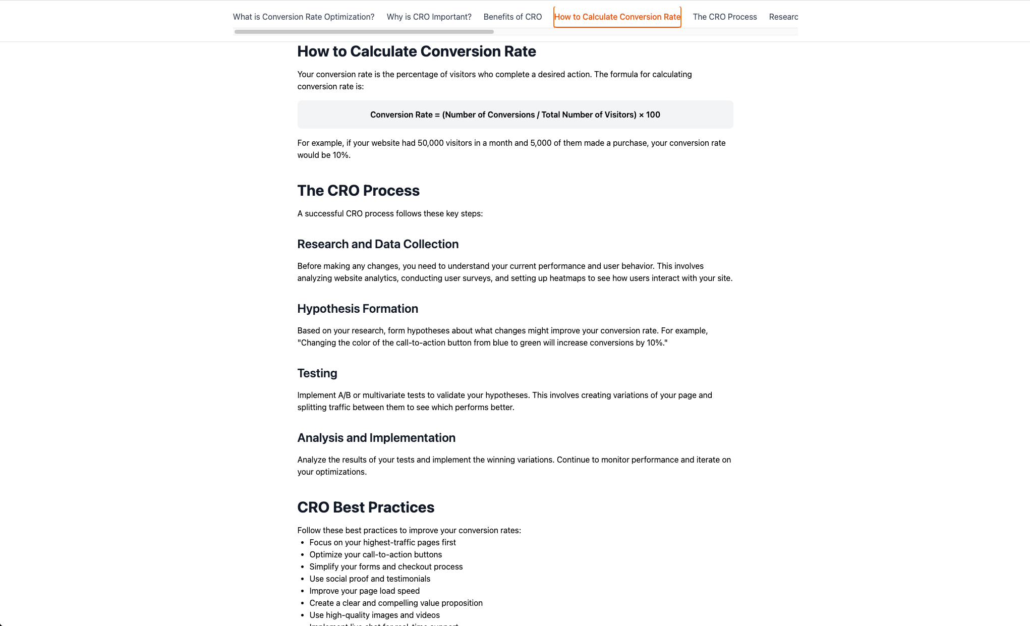
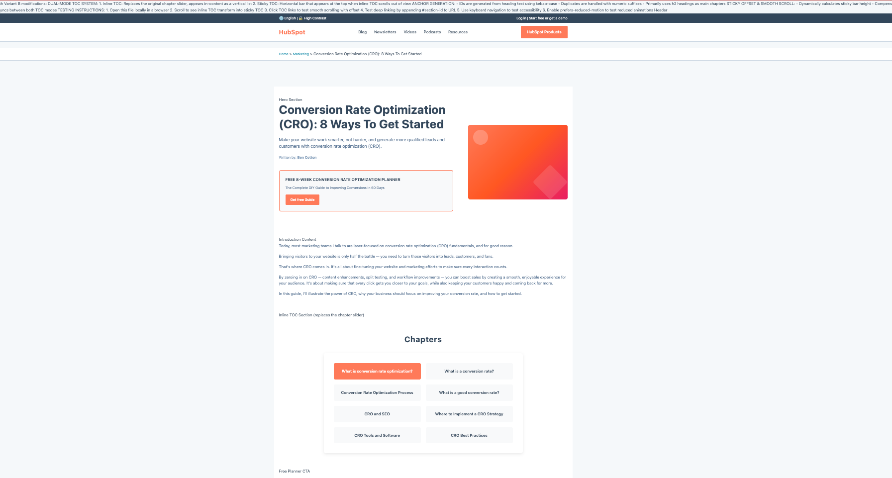
Control page: https://blog.hubspot.com/marketing/conversion-rate-optimization-guide
I found this to be the most ironic and yet perfect page to test. Not only does it talk about conversion rate optimization best practices, but it’s also one of HubSpot Blog's most popular pages according to Ahrefs, and contains one crucial but broken component I’d love to test if I were on their team.
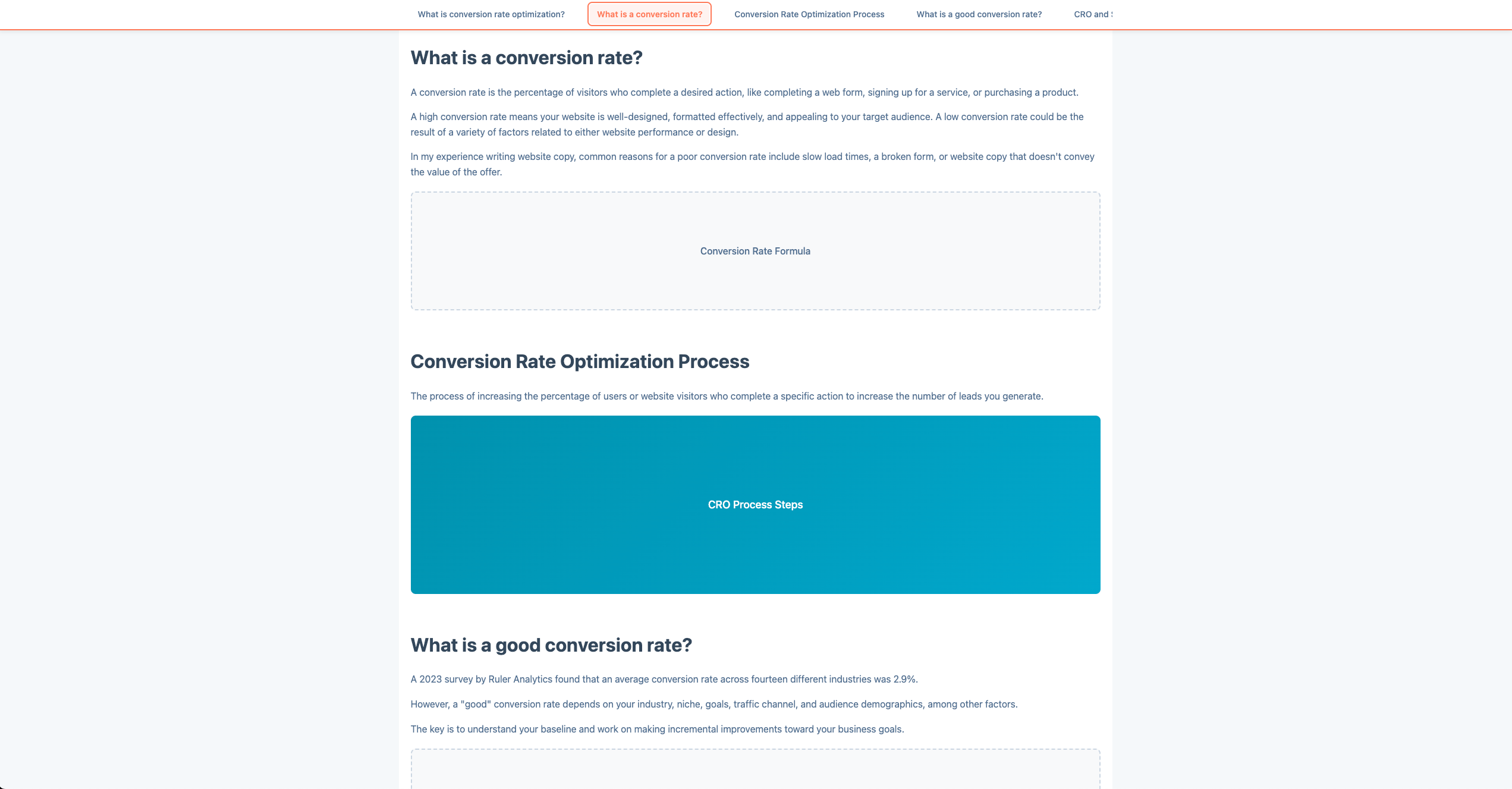
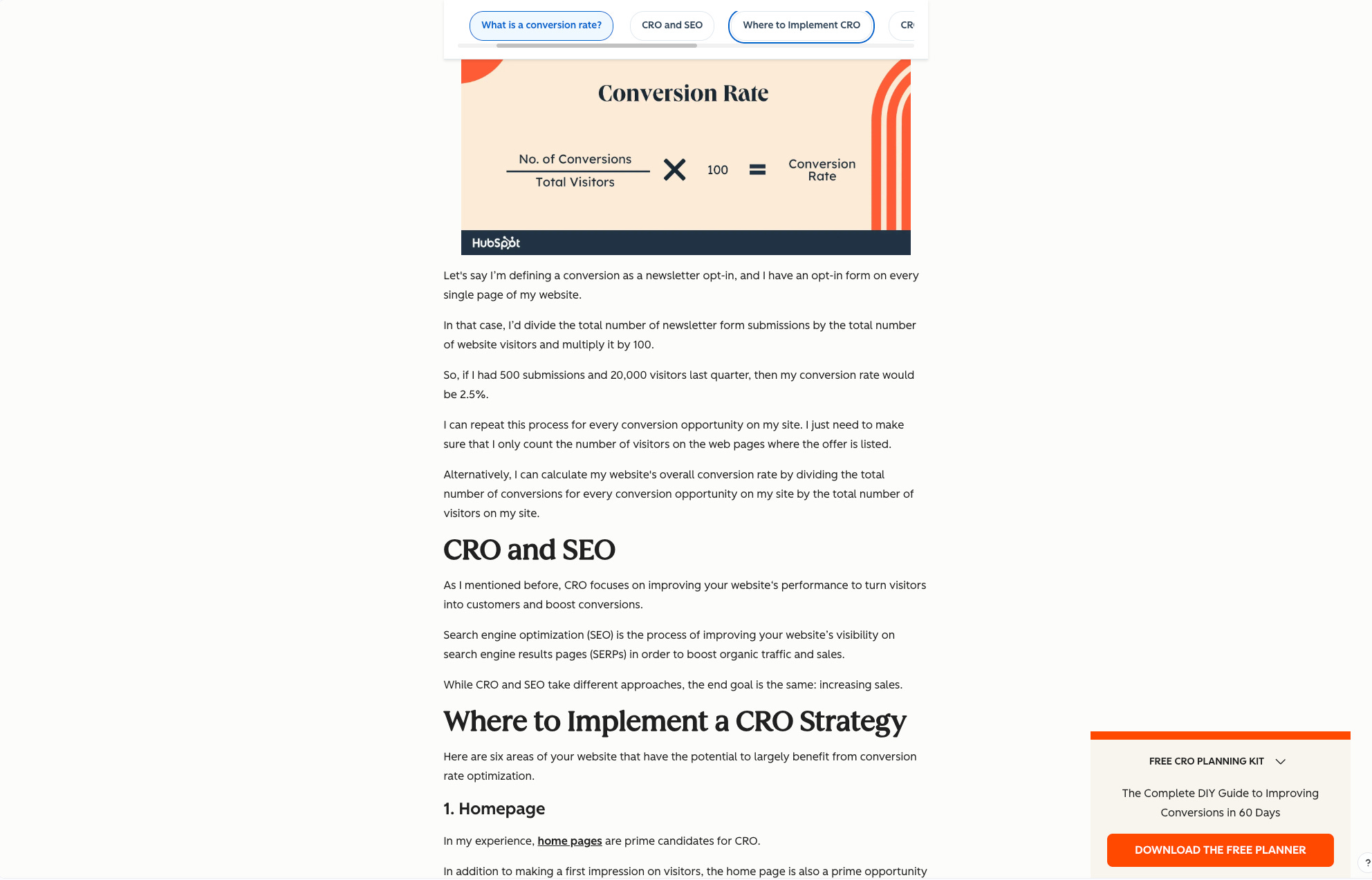
Variant B (the ask): Replace the near-top chapter slider with a Table of Contents that appears inline and later becomes a sticky horizontal bar with:
Scroll-spy active section highlight
Smooth scroll with sticky offset
URL hash updates and deep-link support on load
Accessible link states (
tabindex, visible focus,aria-current)No layout shift on pinning
Deliverable: self-contained HTML/CSS/JS (or React) that demonstrates the above
Acceptance checks: Multi-click TOC works and updates hash; deep-link lands precisely; scroll-spy works; no layout shift on pin.
One-prompt policy: One run per tool (standardized YAML). No retries, no clarifications.
Scoring (1–5 each): Ease of Use, Functional Criteria (passes checks), Design Fidelity, Practicality, Speed, Creativity, Exportability.
Evidence: I captured outputs (screens, code, demos) and logged one-line justifications per score.
This is the section I’d want to test a variant of:
The Ranking (worst → best)
After using a standardized YAML prompt on all tools, the outputs surprised me.
I remained as objective as I could with the evaluation criteria, and standardized my notes on each.
Each review follows a consistent structure:
What happened (plain-English summary of the run)
Where it passed/failed (mapped to acceptance checks)
What I liked / What blocked me
Who it’s for (situational fit)
Scorecard (1–5 per criterion, total / 35)
Cost note (if relevant)
10) Firecrawl OpenLovable — 6/35
Link to project: not available
Link to tool: https://github.com/firecrawl/open-lovable
What happened:
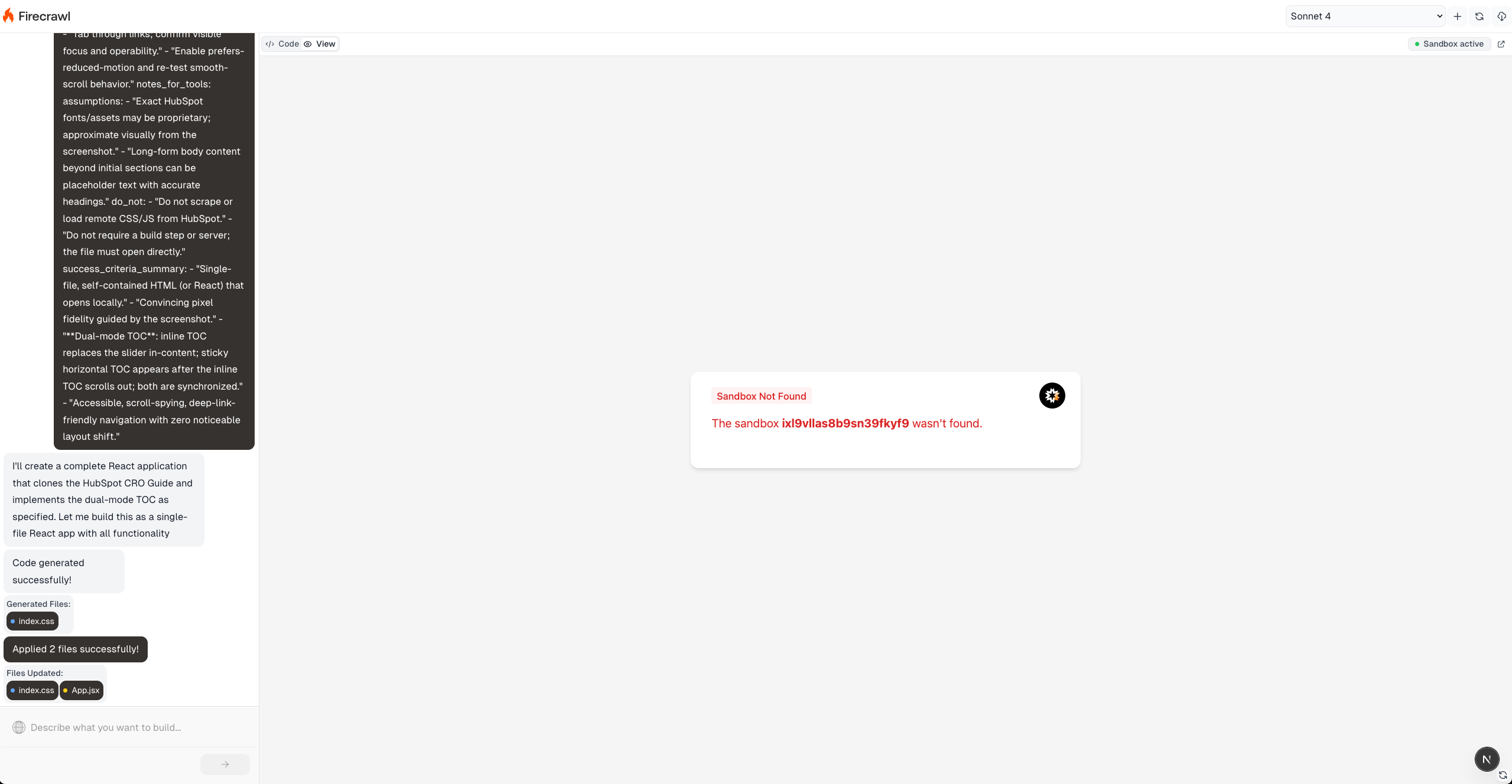
This was more of a “build your own” showcase than a point-and-click tool. I had to clone the repo, install locally, fetch API keys (Firecrawl + E2B/Vercel), and still hit freezes. After the first prompt, it looked like background work was happening, but the preview never reflected updates. I topped up Claude credits when Cursor complained (I prefer to use its Terminal instead of my Mac’s); code regenerated, builds failed for the same reasons, and I finally called it.
Where it passed/failed:
Multi-click & hash updates: Failed (never stabilized)
Deep-link on load: Failed
Scroll-spy: Failed
No layout shift: Not testable
What I liked:
Under the hood, it’s powerful. I can see why devs use Firecrawl as a capability.
What blocked me:
Too many moving parts for this use case; no reliable preview; repeated build loops.
Who it’s for:
Builders who want to wire Firecrawl into their own stack and are comfortable debugging. Not for “one-prompt clone a page” prototypes.
Scorecard: Ease 1 • Functional 1 • Design n/a • Practicality 1 • Speed 1 • Creativity 1 • Export 1 → 6/35
Cost note: Variable; included extra Claude spend just to proceed.
9) ChatGPT-5 (web) — 17/35
Link to project: ChatGPT-5 conversation
Link to tool: https://chatgpt.com/
What happened:
Dead simple to start. I pasted the YAML, it generated something fast—but it didn’t implement the behaviors. Think “there’s a TOC element,” but not the sticky + scroll-spy + deep-link + smooth-offset choreography.
Where it passed/failed:
Multi-click & hash updates: Failed
Deep-link on load: Failed
Scroll-spy: Failed
No layout shift: Not applicable
What I liked:
Frictionless start, blazing speed.
If this weren’t a one-prompt test, follow-ups would likely fix it.
What blocked me:
Missed core mechanics; design felt off-brand (kept black/orange vibes only).
Who it’s for:
Fast ideation when you can iterate. Not for strict one-prompt acceptance.
Scorecard: Ease 5 • Functional 1 • Design 1 • Practicality 1 • Speed 5 • Creativity 1 • Export 3 → 17/35
8) Claude Code (CLI) — 19/35
Link to project: not available
Link to tool: https://claude.com/product/claude-code
What happened:
I could run it only because I’ve installed it before. It produced code quickly and hit some behaviors, but created odd TOC states (multiple tabs “active,” re-scroll on click).
Where it passed/failed:
Multi-click & hash updates: Partial (worked, but buggy state)
Deep-link on load: Partial
Scroll-spy: Partial (conflicting active states)
No layout shift: Mostly fine
What I liked:
Very fast, export-friendly (local files you can push).
What blocked me:
Design fidelity way off (older HubSpot look), proportions broken; would need 2–3 follow-ups.
Who it’s for:
Dev-leaning users comfy with CLI who plan to iterate.
Scorecard: Ease 3 • Functional 3 • Design 1 • Practicality 1 • Speed 5 • Creativity 1 • Export 5 → 19/35
Cost note: ~$0.27 for this run.
7) Bolt.new — 20/35
Link to project: not available
Link to tool: https://bolt.new/
What happened:
Submitting the prompt was clean, but I ran into inconsistent run/preview behavior and “connect to a Project” friction. When I did see output, sections were hallucinated and the brand palette felt stale—yet the TOC component itself wasn’t bad.
Where it passed/failed:
Multi-click & hash updates: Partial (looked right, but preview issues limited QA)
Deep-link on load: Unclear
Scroll-spy: Likely (visual cues present)
No layout shift: Seemed okay
What I liked:
Nice small UX touches (brand-colored scrollbar, arrow icons).
What blocked me:
Reliability of preview; hallucinated content reduces trust for A/B parity.
Who it’s for:
Tinkerers okay with some setup who just need a directional prototype.
Scorecard: Ease 3 • Functional 3 • Design 2 • Practicality 2 • Speed 4 • Creativity 3 • Export 3 → 20/35
Cost note: Using their $25/mo (10M tokens) math, my 260k tokens would be ~$0.625.
6) Replit (web) — 21/35
Link to project: not available
Link to tool: https://replit.com/
What happened:
Surprisingly, it passed all behaviors—multi-click, deep-link, scroll-spy, no pin-shift. The output design, though, was the furthest from HubSpot’s current look (random orange, numbering oddities). Free tier felt locked down for export/publish.
Where it passed/failed:
Multi-click & hash updates: Pass
Deep-link on load: Pass
Scroll-spy: Pass
No layout shift: Pass
What I liked:
Functional choreography done right; some nice touches (icons/arrows).
What blocked me:
Off-brand visuals; exportability felt closed unless you pay.
Who it’s for:
Quick mechanics demo when fidelity/export aren’t critical.
Scorecard: Ease 5 • Functional 5 • Design 1 • Practicality 2 • Speed 5 • Creativity 2 • Export 1 → 21/35
Cost note: Consumed ~40% of free credits.
5) Cursor (IDE) — 22/35
Link to project: not available
Link to tool: https://cursor.com/
What happened:
Pleasant IDE once you’re in. It produced something that looked closer to the real page (felt like it crawled styles), but functionally it only replaced the slider with a TOC—no full behavior set. It also “finished” with no files written until I asked it to drop the code into variant-b.html.
Where it passed/failed:
Multi-click & hash updates: Failed
Deep-link on load: Failed
Scroll-spy: Failed
No layout shift: Not applicable
What I liked:
Great dev ergonomics, strong export/push/clone; nice UI details (block quotes, sidebar).
What blocked me:
Missed core behaviors; required back-and-forth (out of scope).
Who it’s for:
Builders who want an IDE with AI and will iterate beyond one prompt.
Scorecard: Ease 4 • Functional 2 • Design 3 • Practicality 1 • Speed 5 • Creativity 2 • Export 5 → 22/35
Cost note: ~$0.71 in tokens via your agent setup.
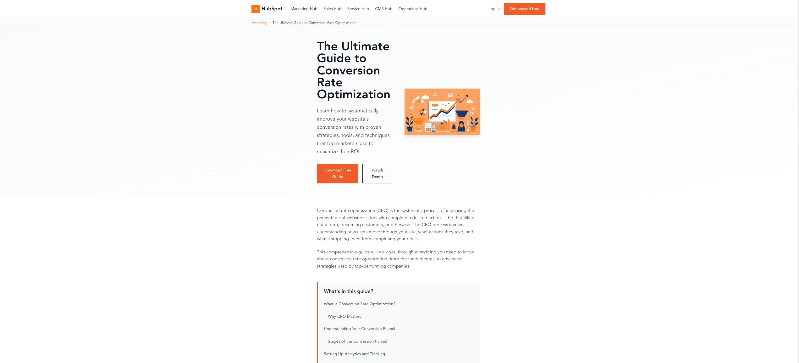
4) Magic Patterns — 25/35
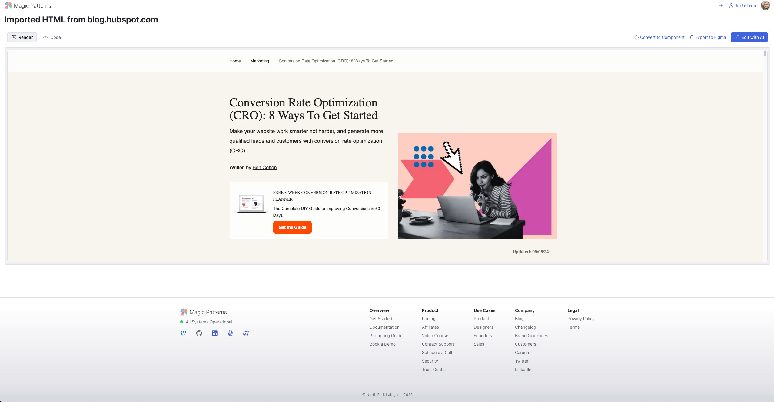
Link to project: https://project-hubspot-cro-guide-dual-toc-407.magicpatterns.app
Link to tool: https://www.magicpatterns.com/ (get extra credits with this referral link)
What happened:
Two different stories:
Prompt-only: functionally correct but off-brand.
Chrome Extension → Figma: captures a pixel-accurate render you can edit natively in Figma, then export—this is where it shines for teams with design systems.
Where it passed/failed (prompt-only):
Multi-click & hash updates: Pass
Deep-link on load: Pass
Scroll-spy: Pass
No layout shift: Pass
What I liked:
The capture → Figma workflow is ideal for many orgs; export options are abundant (Figma, GitHub, zip, copy-as-prompt).
What blocked me:
Prompt-only output is visually off; for this test, I judged the prompt route.
Who it’s for:
Figma-centric teams who want a faithful base to edit visually, then export code.
Scorecard (prompt route): Ease 5 • Functional 5 • Design 2 • Practicality 2 • Speed 5 • Creativity 1 • Export 5 → 25/35
Cost note: $19/seat/mo; per-prompt cost not exposed.
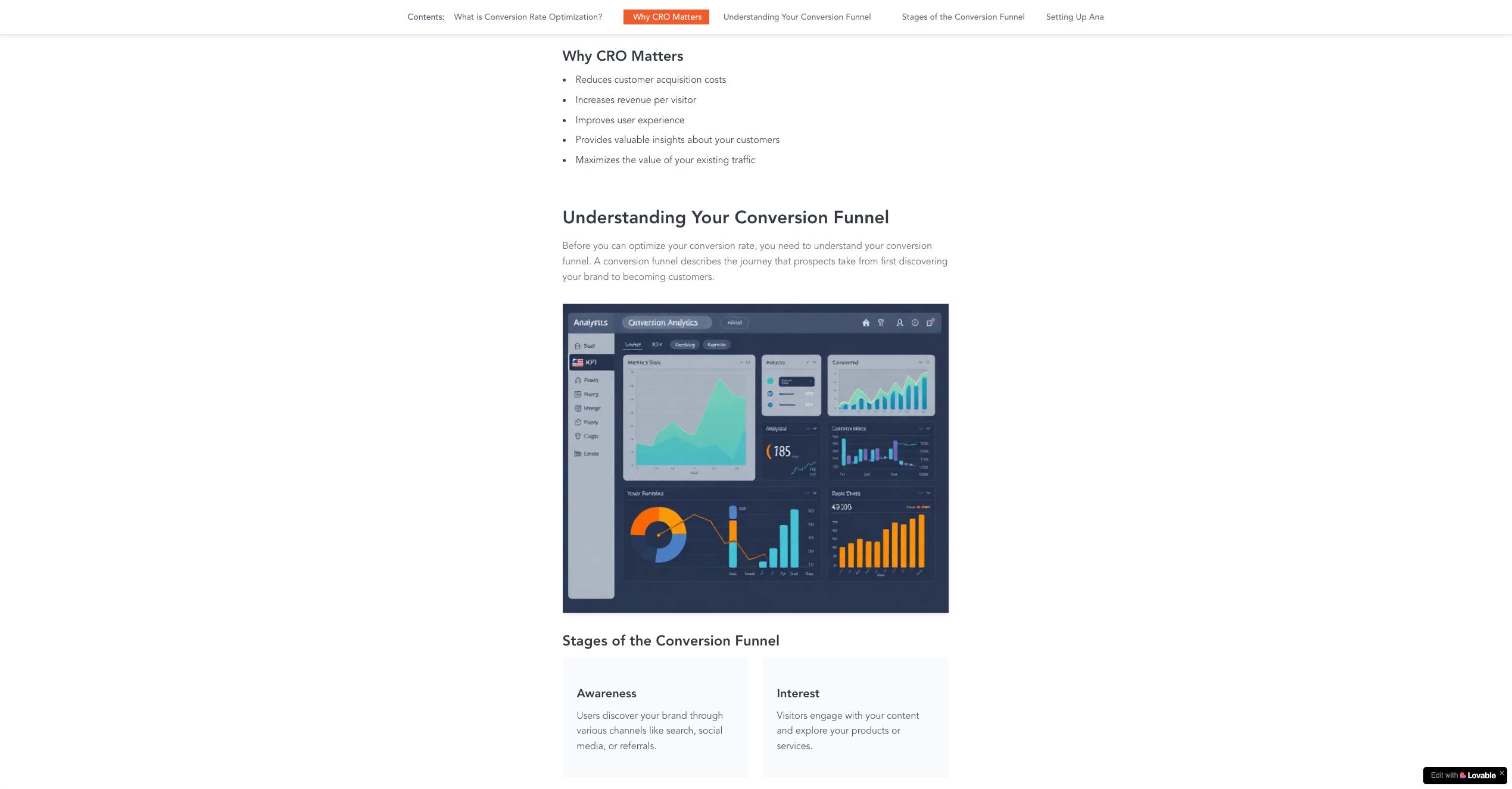
3) v0 — 27/35
Link to project: https://v0-cro-guide-clone.vercel.app/
Link to tool: https://v0.app/ (make sure not to visit the .com domain!)
What happened:
Mostly smooth, except it oddly refused to preview before publishing (“can not detect a page to preview”), so I had to download/export or publish to see it. Functionally, it passed all checks and proposed a creative tile-based TOC pattern.
Where it passed/failed:
Multi-click & hash updates: Pass
Deep-link on load: Pass
Scroll-spy: Pass
No layout shift: Pass
What I liked:
Agentic, deploy-friendly pipeline; NPX-style integration is great.
The tile TOC is a fresh idea worth reusing later.
What blocked me:
Design fidelity leaned on older HubSpot palette; stray commentary blocks cluttered the page.
Still more “idea reference” than drop-in snippet for an A/B tool.
Who it’s for:
Teams with repos/design systems who want a fast scaffold they can wire in.
Scorecard: Ease 4 • Functional 5 • Design 2 • Practicality 2 • Speed 5 • Creativity 4 • Export 5 → 27/35
Cost note: Your calc: ~$0.19 on their free tier budget.
2) Lovable — 28/35
Link to project: https://juancolmenares-abtestprototype.lovable.app/
Link to tool: https://lovable.dev/ (get extra credits with this referral link)
What happened:
This had the best “sit down and go” flow. Pasting YAML on the homepage (even logged-out) worked. It hit most behaviors, but the TOC UX felt rough: active tab could slide out of view in the horizontal scroller; there was a visible horizontal scrollbar.
Where it passed/failed:
Multi-click & hash updates: Pass
Deep-link on load: Pass
Scroll-spy: Pass
No layout shift: Pass
What I liked:
Frictionless start; self-contained code; easy GitHub save & remix.
What blocked me:
Design fidelity: old color memory vs. current HubSpot; UX polish (e.g., side-arrows or gradient fades for horizontal scroll) was missing.
Practicality: Good directional mock, not paste-into-VWO ready.
Who it’s for:
Fast concepting when you’ll hand off to a designer for polish.
Scorecard: Ease 5 • Functional 4 • Design 2 • Practicality 2 • Speed 5 • Creativity 4 • Export 5 → 29/35
Cost note: ~$0.50 (2 credits @ $0.25; $25/mo plan includes 100). Free daily credits not included in the calculation.
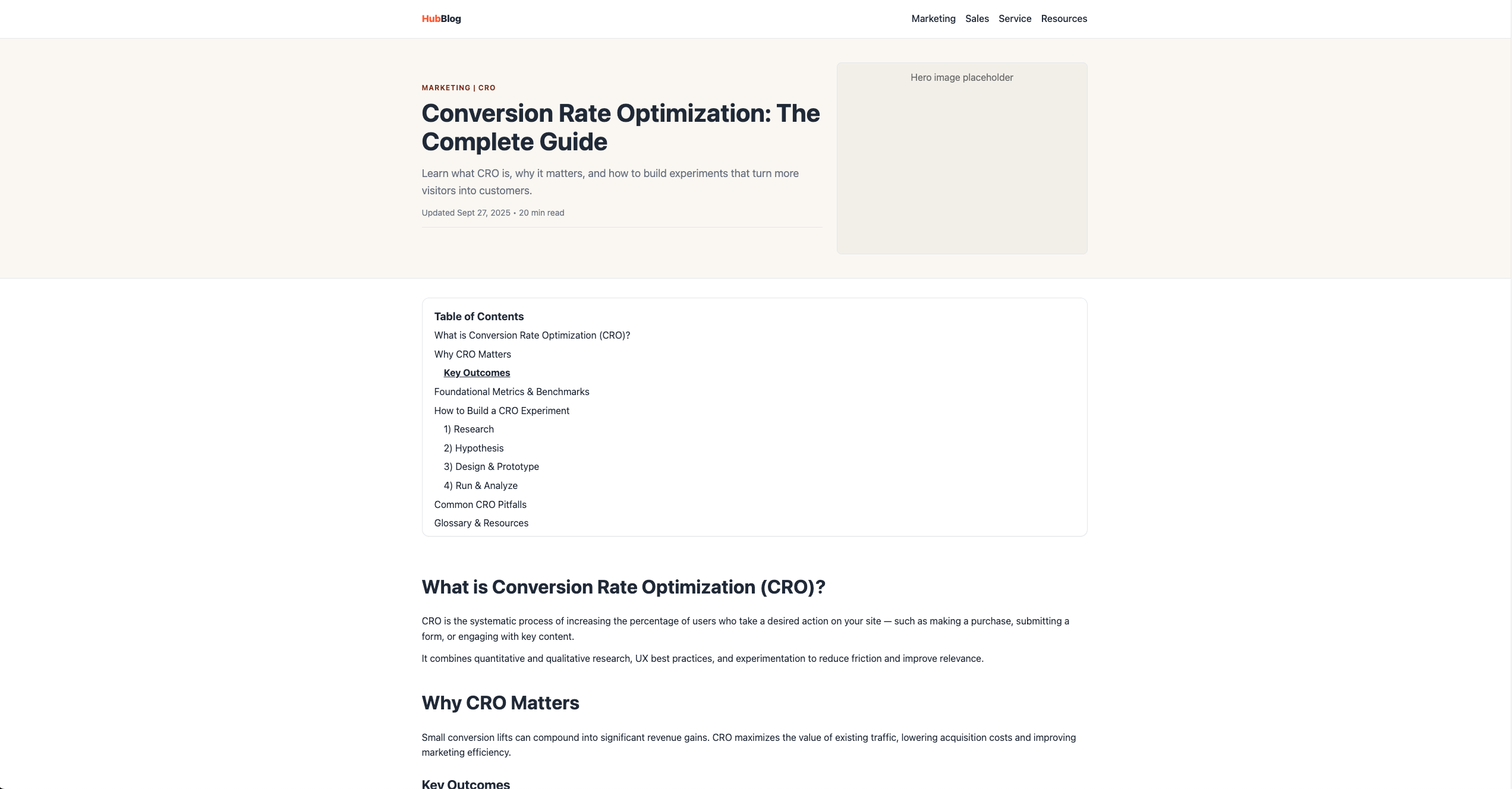
1) Alloy — 29/35 (Winner)
Link to project: https://alloy.app/juan-colmenares/p/61737125-5de3-4d5c-8643-3488c19f99ba (preview link doesn’t perform the #section-X functionality)
Link to tool: https://alloy.app/
What happened:
The 3-step setup (install the browser “Capture,” grab a window, prompt) delivered a ridiculously accurate, dynamic replica—the first time it truly felt like I was interacting with the real page. The TOC behavior wasn’t a perfect “list → sticky bar” as specced; it surfaced as a carousel of buttons (still usable and closer than others).
Where it passed/failed:
Multi-click & hash updates: Mostly pass (worked as buttons; needs list anchors for spec purity)
Deep-link on load: Close (behaviorally sound; would confirm with one follow-up)
Scroll-spy: Mostly pass (active state visible)
No layout shift: Pass
What I liked:
Fidelity: font, spacing, rhythm, components—spot on.
Nice UX detail: a subtle depth style on sticky TOC to signal interactivity.
What blocked me:
Export path isn’t as explicit as v0/Lovable; I’d want a crisp “copy component / export snippet” flow.
Who it’s for:
Marketers/PMs doing A/B prototypes on third-party pages where you need a faithful clone fast.
Scorecard: Ease 5 • Functional 4 • Design 5 • Practicality 4 • Speed 4 • Creativity 4 • Export 3 → 29/35
Cost note: $20/mo unlimited prompts; per-run cost not exposed.
Honorable mention: Orchids
I excluded it this round—blocking bugs during test week made it unfair to score. Their team was responsive in Discord; I’ll retest later.
What the results actually mean
Passing the choreography matters. Replit, v0, Magic Patterns, Lovable regularly got the mechanics right.
Design fidelity is the unlock for A/B prototypes on pages you don’t own. Most tools hallucinated content or defaulted to stale brand memories; Alloy’s capture-and-modify approach won here.
Export is a hidden bottleneck. If I can’t quickly copy/paste or drop a component into VWO/Optimizely, the prototype stalls. v0 is excellent (NPX), Lovable/Magic Patterns are good (repo/Figma).
One prompt rarely equals “done.” Most outputs were lo-fi direction that a designer/dev can harden in 1–2 micro-iterations—fine for speed, but outside this test’s scope.
Final reflections
I came in skeptical about “one-prompt cloning” and left… still skeptical. Even with a URL and full-page screenshot, tools ran into crawl/render limits or invented content. The outlier was Alloy—the last tool I added—and it delivered the most convincing result by far. No affiliation or sponsorship; just credit where it’s due. Or as we say in Venezuela, le pico un quesillo.
A few takeaways to keep:
One-prompt nirvana isn’t here yet—and that’s okay. Short, iterative prompting is how you get reliable quality.
Prompts compound. I refined the YAML seven times as I saw common misses.
Pick the tool that fits your process, not the inverse.
A/B prototypes on pages I don’t own: Alloy.
Figma-first teams: Magic Patterns via Chrome capture → Figma edit → code.
End-to-end vibe-coding: Lovable (Cloud/AI/SEO updates are compelling).
IDE builds: If I’m all-in on Claude, Claude Code; otherwise Cursor still tempts me for its context/docs indexing.
Repo-integrated scaffolds: v0 (NPX, production-adjacent).
Revisit later: Replit, Bolt, Orchids, Firecrawl as stability/features evolve.
What should I test next?
I’m eyeing AI agent builders. Lots of hype, lots of noise—very few mainstream-ready results. If you’ve shipped something real (or hit a wall), tell me in the comments.